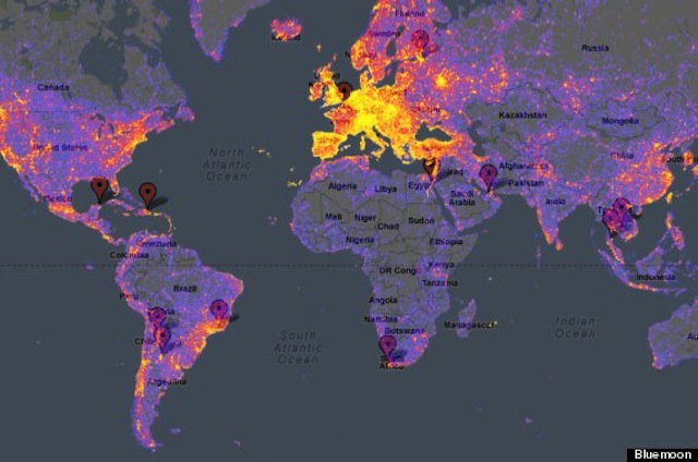
Europe is heating up! © Bluemoon
Vagabondish is reader-supported. When you buy through links on our site, we may earn a small affiliate commission. Read our disclosure.
Estonian tech firm Bluemoon has taken data from the photo-sharing service Panoramio and created a map detailing the most and least traveled destinations around the world, based on photos.
The map reads a lot like a heat-sensitive one, and shows which places are the “hottest” (represented in yellow) and the “coldest” (in blue). Areas without photos from Panoramio are gray and a good amount of them fall in Canada and Africa. The eastern seaboard of the U.S. and most of Europe were found to be amongst the top destinations.
More on Bluemoon’s travel photo data analysis can be found at Huffington Post.


