Architecture is always subjective. For everyone who sees the Barbican or Trellick Tower as brutalist monstrosities, you’ll find someone else who believes them to be modernist masterpieces (personally, I rather like the Barbican as architecture; I just wish it was easier to navigate!).
Vagabondish is reader-supported. When you buy through links on our site, we may earn a small affiliate commission. Read our disclosure.
But a few buildings really are monsters in my view which I’ve listed below as my top ten “hates”. Warning: I haven’t pulled any punches and don’t expect everyone to agree with me ”¦
#1: Canary Wharf
I really loved the central tower when it stood alone, a wonderful vision with its neat pyramidal roof and gleaming glass sides. Now it’s surrounded by rivals, so you can’t see any of them clearly and the whole effect has been lost; instead of a dramatic skyline, Canary Wharf presents a chaotic jumble. What a missed opportunity.
#2: The Gillette (officially the Strata Building)
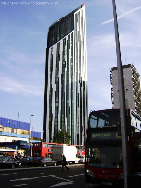
London Strata Building © Toby Jagmohan
It’s an ugly block, renowned for having wind turbines installed in its top storey. Well, the wind turbines are just cosmetic greening — they don’t produce much electricity — and the building doesn’t seem to have made up its mind whether it wants to be round or square. It’s got no real character at all.
#3: Elephant & Castle Shopping Centre
Despite many attempts to make this building cleaner, better or more interesting, it just seems to defy human ability to do so. It’s not helped by being stuck in the middle of a vast gyratory system. Incoherent and ugly.
#4: Anish Kapoor’s Weird Red Olympic Sculpture
I used to love Kapoor’s work but not any more. This thing looks like someone got the Eiffel Tower and used a blowtorch on it a la Salvador Dali. I don’t really understand what use it is or what it’s doing. And if it’s a modern folly… well it’s a very foolish one.
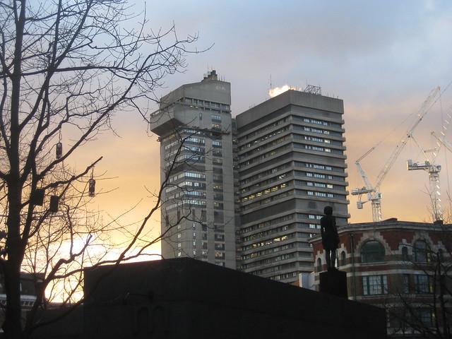
#5: Guys Hospital
I know from experience that it’s decent enough inside, but the exterior is strangely irrelevant — why split it into two towers? And why the antilevered-out top of one of them? The concrete towers don’t even relate to the red brick buildings underneath. What a dog’s breakfast.
#6: Tower of London
Why do people always nominate modern architecture for ‘uglies’? There are plenty of horrible buildings from earlier eras. I really dislike the Tower of London. If you want to see what a real Norman castle should look like, it’s Norwich — creamy Caen stone, delightful detailing of blind arcades running around the sides, on top of a proper castle mound. The Tower on the other hand always looks a bit too narrow and much too grey and dirty. I bet all the Saxons thought it was horrendous.
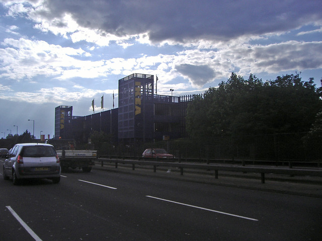
#7: Ikea (North Circular Road)
This is one of two destination buildings on the North Circular that are utterly monstrous — the other being Wembley — but Ikea just pips its rival at the post, partly because I’ve spent so many frustrating afternoons trying to navigate its one-way see-every-bed-chair-and-table-in-creation-before-you-get-to-the-kitchenware-you-actually-want system, and partly because it’s so bad and spineless. In fact I don’t think it’s really architecture — it’s a flat-pack, veneered chipboard building!
#8: Westminster Cathedral
I do have a soft spot for this building, but it’s undeniably monstrous — it always feels less like a cathedral to me than a very large railway station (St Pancras by contrast feels more like a cathedral than a station at times). The mix of Byzantine, Romanesque, Edwardian and Art Nouveau (unless I’m just imagining the last) is disorientating to say the least and the whole thing is on a mammoth scale that always makes me feel a bit swamped.
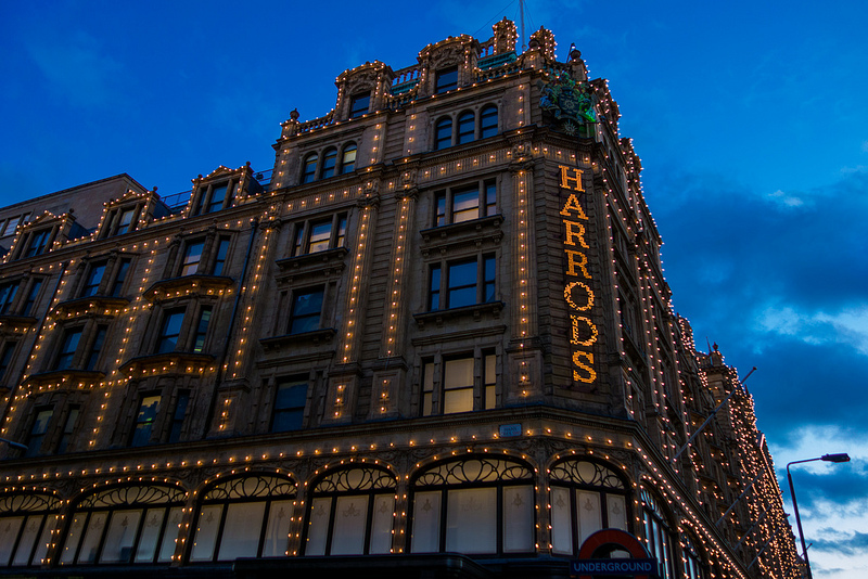
#9: Harrods

Harrod’s, London © Nan Palmero
Yes, seriously. It’s undeniably cute, especially when the fairy lights are on. But although it’s pretty in a certain way, I do find it a bit garish architecturally. Too big, too much going on and too ornate — an attention seeker. But maybe that’s the whole point.
#10: Buckingham Palace

Buckingham Palace, London © Giorgio Tomassetti
My last selection may surprise many but take a good look at Buck House and tell me what architectural value you see in it? It’s an awful Stalinist experiment in getting as many rooms as possible crammed into a big block of rock. No character, squat proportions and ugly stone. If you want to see the big-block-of-rooms job well done, look at the former London County Hall, which does it with style and assurance.
(Oh, and I recommend some centrally-located London luxury suites for easy access to all the stops in the above architectural tour.)


